Messages with the tag: fg_feed

These messages are to be picked up by the blog feed at FamilyGames.com.

November 18, 2017

Valvo — now for Android devices and web browsers

Categories: Announcements, Close-up — Tags: , , ,

One of the first releases from FamilyGames.com in the 1990s was a strategy game named Valvo. It’s a simple game that combines the barest essence of backgammon with a faint whiff of snakes and ladders. And it has valves. Now we’re releasing Valvo all over again in a free version for the web and an inexpensive paid Android app that you can get through Google Play.

A Valvo game on a 4x4 layout

Valvo is a game for two people playing at the same device, or for one person playing against the built-in AI. Play is divided into short rounds in which each player’s pawn travels from a home square towards a destination. At the end of the round, points are awarded to one side or the other based on which pawn has made the most progress. The scoreline shows the points for the current round (if one is in progress) and the cumulative score since the totals were last reset.
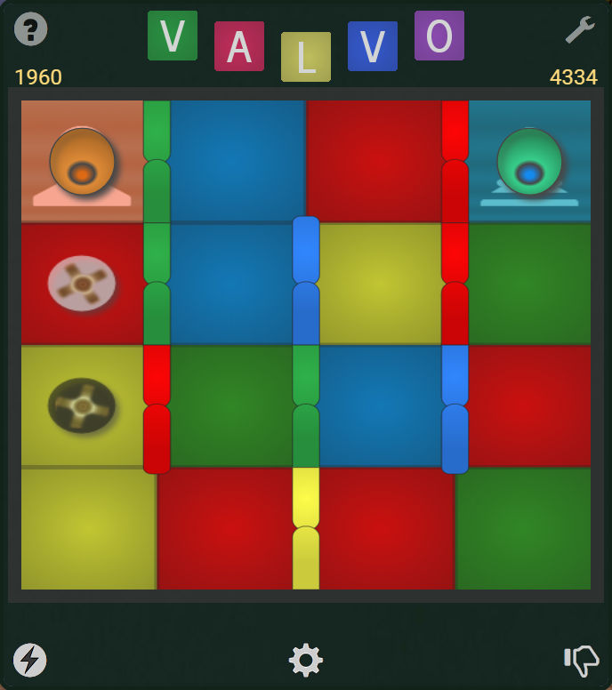
The starting position of a Valvo game round

Valvo at the start of a round, on a 4×4 layout with 4 valve colors. The opposing pawns are in position on their home squares, facing ahead. Left has first move this round (it alternates). The circular “carets” in the left column show where Left’s pawn can move. Left is behind in the overall match, with 1960 points to Right’s 4334.

An important feature of Valvo is that you select your move from a small number — at most two — of randomly-chosen possibilities. This is one of the ways in which it somewhat resembles backgammon. (Another is that each player is in a race to reach the other player’s home position.) On every turn you will be offered the option of moving two spaces, assuming your way is not blocked. Half of the time, you will also have the option of moving only one space. The other half of the time, if enough spaces ahead are clear, the second option will instead be to move three spaces.

Valvo’s most distinctive feature is its valves, which bear the same colors as the board squares. When a pawn’s turn is over, the valves that match the color of the square it landed on immediately slide open (while any currently open valves close). By cutting across the usual lanes of travel, an open valve offers a shortcut either forwards or backwards. If a pawn lands beside an open valve, it must use that valve, even if its position suffers thereby. If a pawn lands between two open valves, it must use the disadvantageous one. If multiple valves are open in a row, a pawn entering the first one must continue through the others as well until it can go no farther. A key element of Valvo strategy is to plan ahead so that the valves will be advantageous to your own pawn and deleterious to your opponent’s.
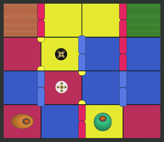
A Valvo move showing the action of valves

Right (with the green pawn) has just moved onto a yellow square, causing the yellow valves to open. Left, who is now to move, is given the choice of traversing two squares (light caret) or three (dark caret). In the first case, Left will advance through the open valve to the third column, blocking Right’s progress and ending the game with a win. In the second case, the open valve on the left will demote Left to the first column, giving Right the advantage for now.

The end of a round comes when either player reaches the destination, or when neither player can move (because the pawns have blocked each other). In either case, the points for the completed round are awarded based on the finishing positions of the pawns. The board then resets with a new randomized color distribution and the next round is ready to begin.

A match ends when the cumulative score reaches a winning total as agreed upon by the players beforehand. The size of the winning total is up to you. As a starting point, we suggest multiplying the number of squares in your Valvo board layout by a factor of 5 to 10. For instance, if you are playing with 6 columns and 5 rows, an objective of 150 to 300 would be reasonable. The advantage of this using this rule of thumb is that it keeps the number of rounds required to play a match approximately equal, regardless of the layout used. If you prefer shorter or longer matches, simply decrease or increase the factor.
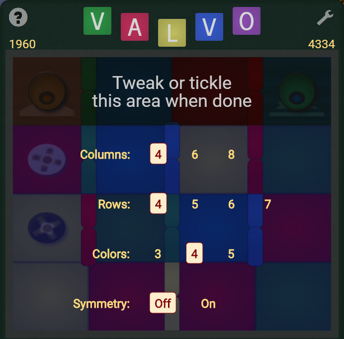
Configuring the layout in Valvo

Configuring the layout in the demo version of Valvo (the app version provides additional options). The layout panel opens when you click or tap the configuration cog-wheel button below the game board. To dismiss the panel, click or tap in the darker upper bar. (N.B. Button locations are shown on the full board image above.)

Valvo’s board layout is configurable between rounds only — you can’t change the board size in mid-round except by first abandoning the round. (To do that, click or tap the thumbs-down button at the bottom right below the game board.) The app version of Valvo, which is available for Android devices on Google Play, gives you full control over details of the board layout. It also lets you vary the strength of the program AI across a wide range, even during the course of a round. The hemisemidemo version of Valvo, which you can play for free on FamilyGames.com, has similar but fewer layout and AI options.
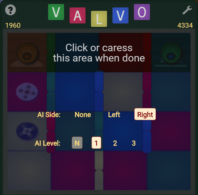
Configuring the AI in Valvo

To configure either side to be played by the computer, click or tap the lightning-bolt button at left below the game board to open this panel. As with the board layout options described above, the app version of Valvo provides some options not shown here. To dismiss the AI panel, click or tap in the darker upper bar. (N.B. Button locations are shown on the full board image above.)

Valvo includes a help screen that compactly describes the details of play. Click or tap the question mark at the top left of the game screen to access it. Each help text is accompanied by an illustration, or a sequence of illustrations. The illustrations in a sequence advance automatically at intervals unless you take control manually with the accompanying navigation arrows.
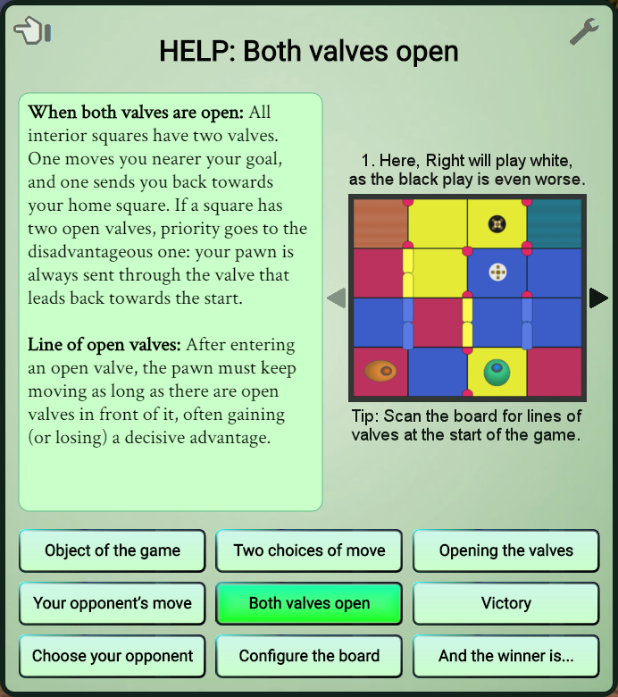
The Valvo help screen

This screen provides help for Valvo in nine topics, each individually illustrated. When a topic has multiple illustrations (like the one shown here), navigation arrows are provided for manually stepping between them. If you don’t use the arrows, the sequence will advance automatically every few seconds.

Valvo also includes a settings screen, where you can switch on or off the built-in music soundtrack and the graphical backgrounds feature. Ten or so varying graphical backgrounds are included. Cycle through them until you find one you like. The images appear in the page background, behind the game proper. If you switch off the graphical backgrounds feature, a simple gradient fills the background area. On some devices, only a small amount of background area is visible regardless of which background style you choose.

November 2, 2011

Bradley, a commercial message

Categories: Fun — Tags: , , , ,

But not really a commercial. Just a simple song about a schoolyard spat unimproved by Santa’s Secret Valley. Those who brave this video will hear (pianoware and vocal) but not see me; titles and the lyric are the only imagery.

October 20, 2011

Hierophant 1.7.5.2 release notes

Categories: Announcements — Tags:

This is a maintenance update of the FamilyGames.com freeware game Hierophant. Changes include fine-tuning of the installer and minor cosmetic tweaks.

Button to start Hierophant download Download Hierophant. After downloading, open the file to install the game.

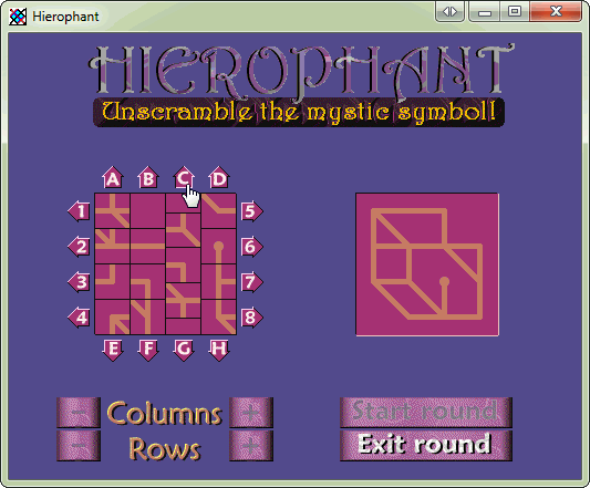
For those who don’t know Hierophant, it is a simple 2-D game, generally reminiscent of a 4×4 tile puzzle. Unlike the usual toy version, however, there is no missing tile. Instead, movement is permitted by having the rows and columns wrap around. The object of Hierophant is to restore a randomly-generated ‘mystic symbol’.

Hierophant is compatible with computers running any version of Microsoft Windows since Windows XP.

Hierophant screen shot

Scrolling a column in Hierophant by clicking one of the arrow buttons (C) around the board.

October 12, 2011

Christmas Trivia Screen Saver version 1.7

Categories: Announcements — Tags: , , ,

It seem that there are lots of folks who still like to have our Christmas Trivia Screen Saver running on some screen around the house during the holiday season, and we’re happy to continue to provide it as a free treat for Windows users. For several years, however, the screen saver has been in need of an overhaul to correct a number of small problems that cropped up with the release of successive versions of Windows.

Screen saver: The living-room scene

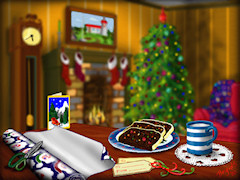
The living-room scene in the Christmas Trivia Screen Saver

Now those problems have been addressed, and a new version of the screen saver is available for download effective immediately. If you already have the screen saver installed, we recommend that you explicitly uninstall it before installing. Please note that this release applies only to Windows XP, Windows Vista and Windows 7.

The main action in the Christmas Trivia Screen Saver is a quietly animated fireside scene with a flickering fire, twinkling Christmas lights, and a working grandfather clock. In the foreground is a table with a snack set out for Santa, though it’s not he who finds it and starts to nibble.

Screen saver: A trivia page

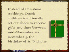
One of 60 trivia pages that appear at intervals in the screen saver

Every now and then, a page of easy-to-read text reveals a Christmas fact you probably didn’t know unless you hang around our trivia site at Christmas time. With sixty different pages to view, there are plenty of fascinating nuggets to keep you entertained throughout the season.

MIDI renderings of fifteen Christmas carol arrangements provide an uninterrupted soundtrack if desired. Settings to control the music, the frequency of the Christmas trivia, and more options are available through Windows’ display customization controls (see this PDF read-me file, also included in the download, for more details).

Button to start screen saver download Download the screen saver. After downloading, open the file to install the software.

We hope you enjoy this screen saver, and we’d be delighted if you make it part of your end-of-year celebrations this year.

August 4, 2010

The world in a small window

Categories: Close-up — Tags: , ,

The biggest new feature in version 1.9 of World Geography Tutor, which we’re rolling out this week at FamilyGames.com, is the optional larger view that is now supported. Some users have found WGT’s small window size a matter of curiosity since the app first came out back near the turn of the century, and admittedly it might seem like an odd choice. After all, is it not more convenient to work on a large, non-scrolling map if the monitor screen is big enough? Why doesn’t World Geography Tutor provide that option?

I’m not sure I’ve ever answered this question in public, though I’ve explained the reason often enough to individuals. In fact we particularly wanted the window to be small enough that the user would be required to scroll. The issue is not one of convenience, but of learning theory. On a fixed map, you might think you’re memorizing the location of The Gambia, but in fact your memorization is clouded by a detail that should be irrelevant but is irresistibly exploited by your memory as the new information is processed. That detail is the position of The Gambia on the display. On a fixed map, each country stays put with respect to the enclosing rectangle, be that a window boundary or a monitor screen, and that extra positional information is included in the new memory. While you remain at your computer, the added information, arbitrary though it is, will actually make recall easier. But it’s also a crutch. In an environment where the positional cue is absent — a conversation, say, or a test — recall won’t be nearly as good.

What you should really be doing is memorizing each country in the context of the shape of its containing land mass and the countries surrounding it on the map. It means far more to know that The Gambia is on the west side of Africa nested inside Senegal than that it is on the left side of the monitor screen two centimeters below the logo. On a scrolling map, your memory is compelled to depend more on the geographically-relevant cues, and the importance of the physical context is reduced. Since the learning goal is primary, we went with a scrolling map.

May 12, 2010

I Live At Santa’s House! v1.8

Categories: Announcements — Tags: , , ,

This new release of our Christmas game for ages 3-7 is an incremental upgrade to address a couple of long-outstanding issues.

1) The installer. Although our old installer worked reasonably well under all current Windows operating systems, including Windows 7, it fell short of full compatibility. An effect of the change is that saved games and other data are no longer stored under the Program Files folder, but under the public application data folder instead.

2) The configuration system. Configurations in I Live at Santa’s House! have two purposes: on the one hand, they allow certain customizations for one or more children individually; and on the other, they create separate identities for saving games. They are created with the Santa’s House configuration utility, SHC. Previously, creating a new configuration was too complex for many users to bother with, involving the manual creation and editing of a desktop shortcut, among other steps. Now it’s as easy as pie. We’ve added a manager for multiple configurations to SHC, and all the hard work is done for you.

For those who don’t know, I Live at Santa’s House! is one of our most popular games. It gives little ones a chance to find out what life is like for an elf living and working in Santa’s House at the North Pole. Testing toys, wrapping gifts and baking cookies are just a few of the activities an elf can enjoy, so it’s no wonder that this game has been a seasonal favorite for many families year after year.  Kids love the idea of helping Santa, especially when it’s so much fun!


Powered by WordPress